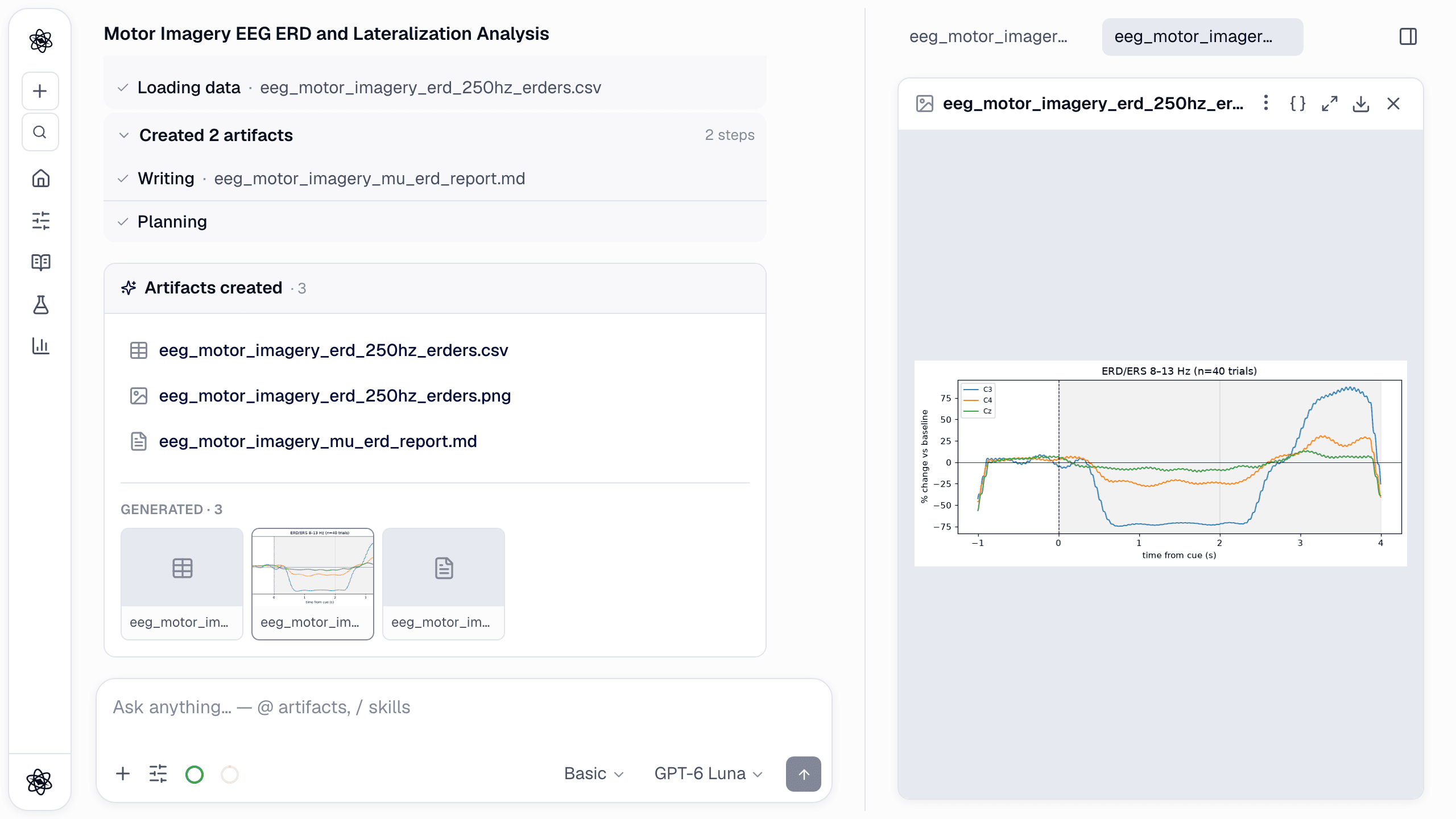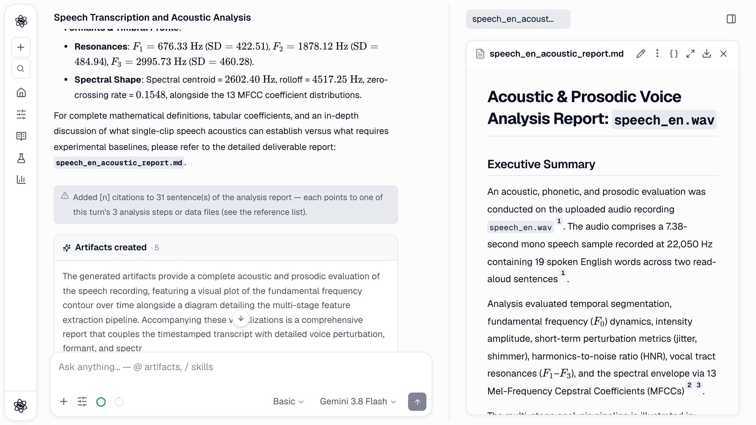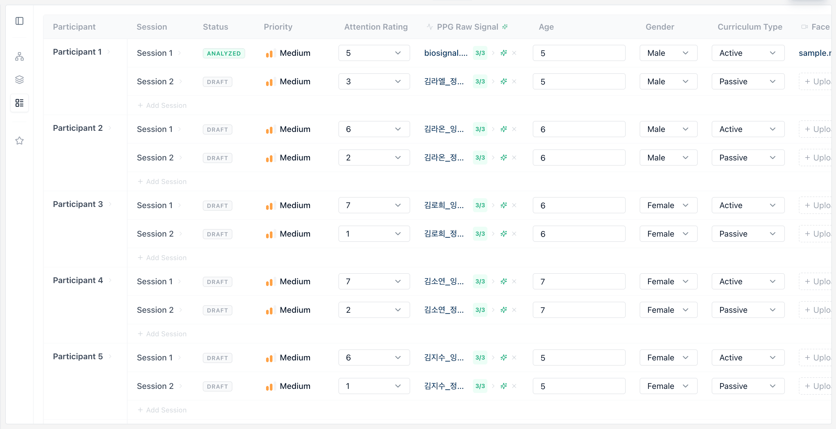
Usability studies produce a messy pile of artifacts: questionnaire exports, screen recordings, interaction logs, eye-tracking files. Most teams spend more time assembling that pile into something analyzable than actually learning from it. Here is how HCI teams run the whole pipeline in Neutropic — every screenshot is from one real session on a two-version A/B study (sample data, 48 participants).
Step 1 — Drop in the export and say what it is
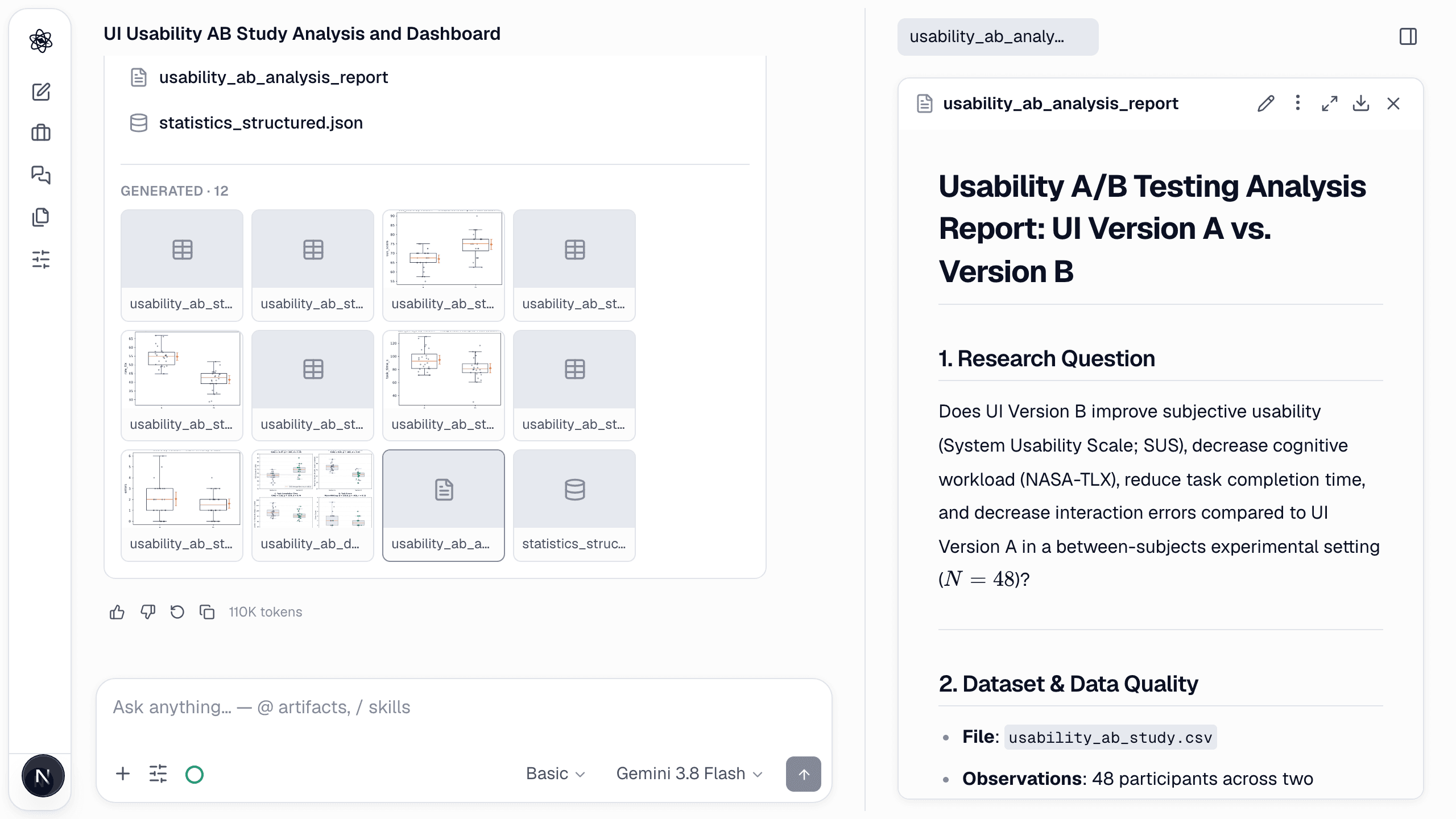
Attach your Qualtrics or CSV export and describe the design in one message. Neutropic recognizes SUS, NASA-TLX, and UEQ item structures, applies the correct scoring (including reverse-coded items), and reports scale statistics with reliability alongside the scores — so a suspicious alpha never hides inside a spreadsheet.
/analyze usability_ab_study.csv is a between-subjects usability study of two UI versions (A vs B, 48 participants): SUS items sus1-sus10 (1-5), NASA-TLX subscales (0-100), task_time_s, and errors. Score SUS and NASA-TLX, compare the versions on SUS, workload, task time, and errors with effect sizes, and produce a summary dashboard figure.
Step 2 — Read the report that states the question first
The analysis report opens with the research question, the dataset and its quality audit (48 rows, no missing values, all SUS items in range) before any comparison — twelve artifacts come out of the one message: scored tables, per-measure group plots, descriptives and a dashboard.
Step 3 — A/B tests with the right test
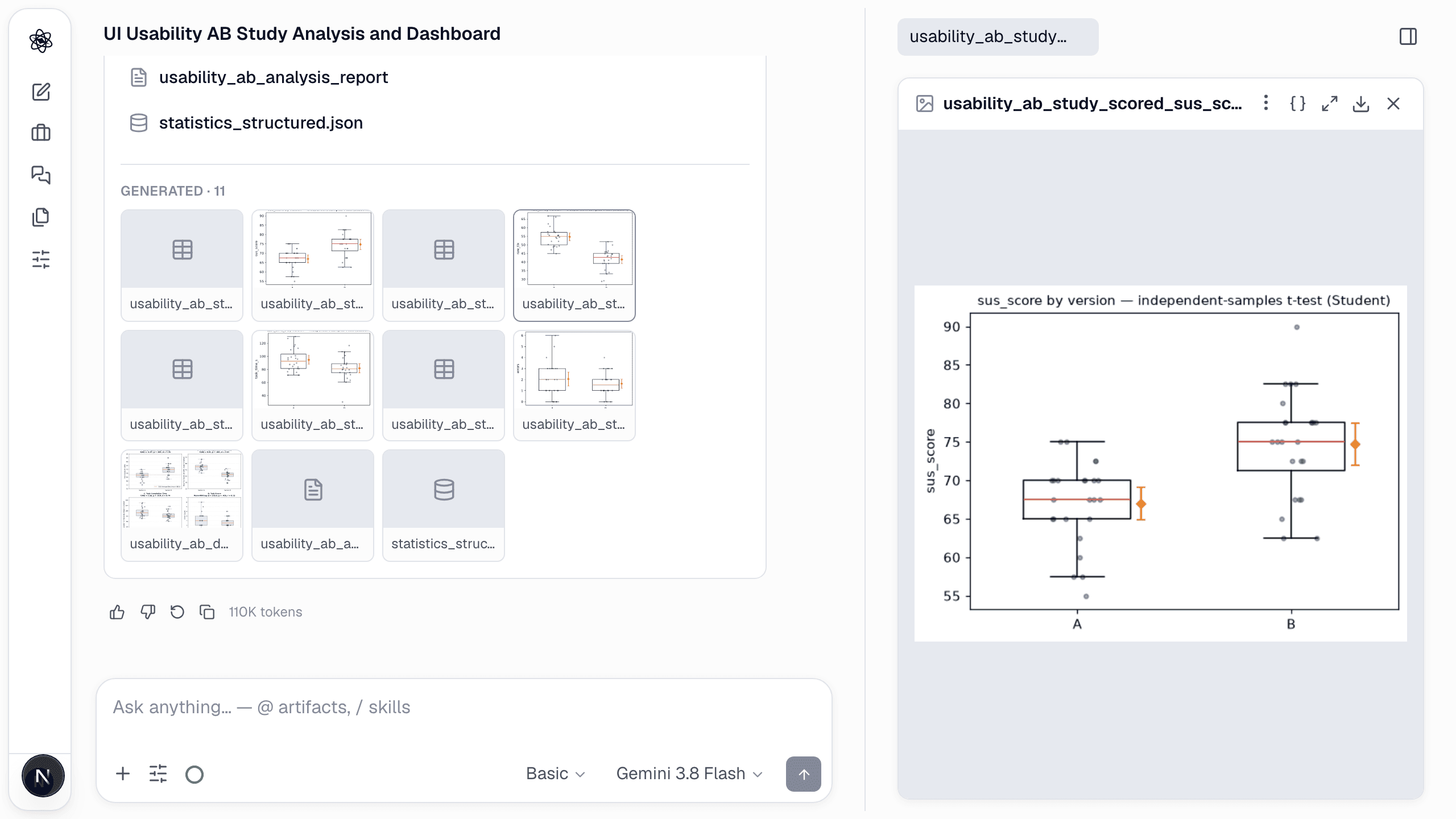
Describe the design — between or within subjects, the outcome measure, the sample — and the agent picks and justifies the analysis; on Deep effort the review agent verifies the choice. Results come back as an effect estimate with a confidence interval and a plain-language read, not just a p-value.
Step 4 — One dashboard for the design review
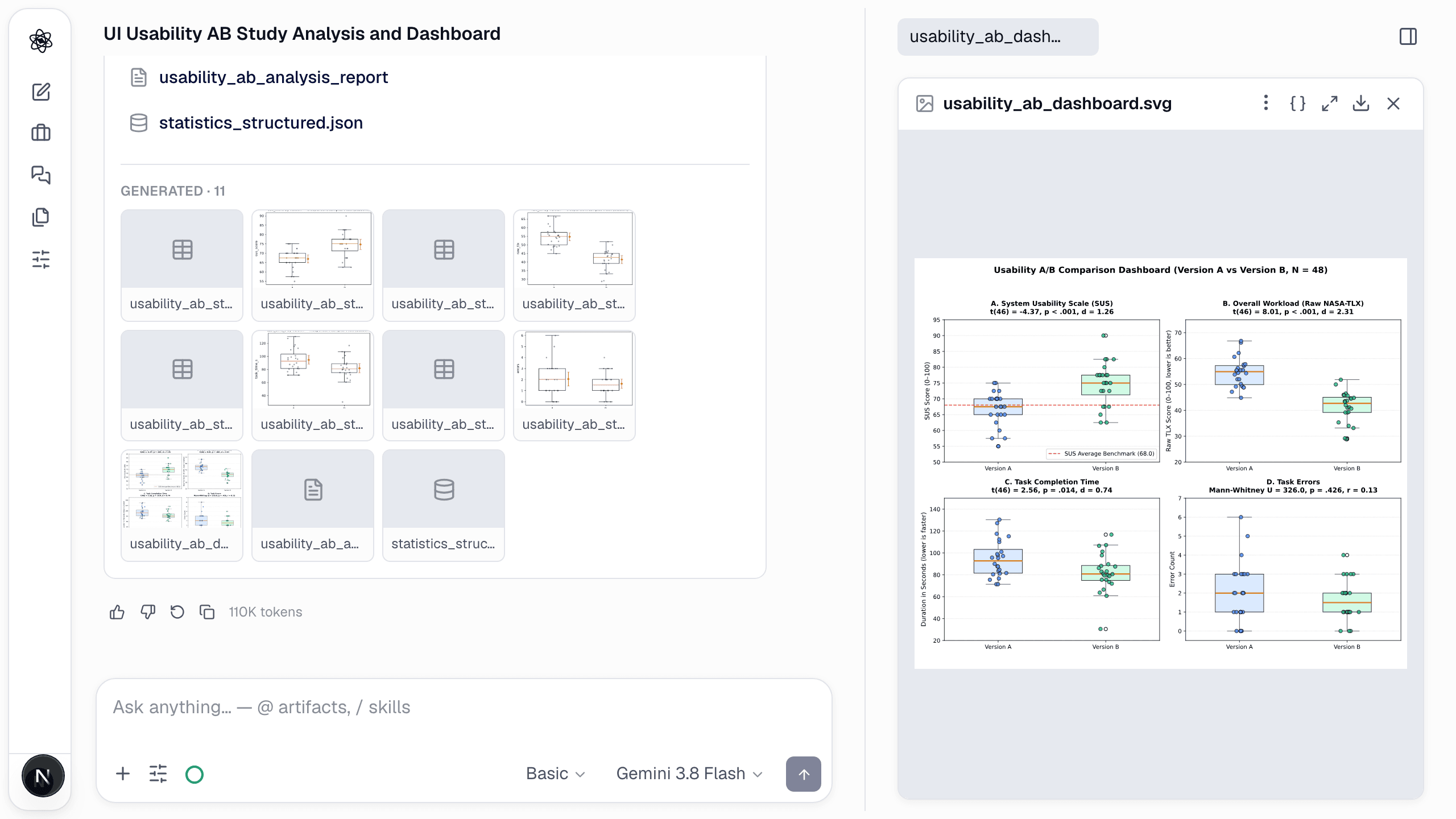
Ask for a dashboard and the four outcomes are composed into one figure, each panel carrying its test statistic and effect size: SUS t(46) = −4.37, d = 1.26; NASA-TLX d = 2.31; task time d = 0.74; errors Mann–Whitney, r = 0.13.
Interaction logs and gaze
- Funnel and path summaries from raw event logs; task time, error, and hesitation metrics per condition; segments where behavior diverged between variants, surfaced automatically.
- Eye-tracking exports become AOI-based metrics and heatmaps on your actual interface screenshots. Ask "did participants ever look at the new control?" and get an answer with the frames to prove it.
One report, fully traceable
At the end you get a report where every figure links to the code and data that produced it — ready for a design review today and reproducible when someone questions it a quarter later.